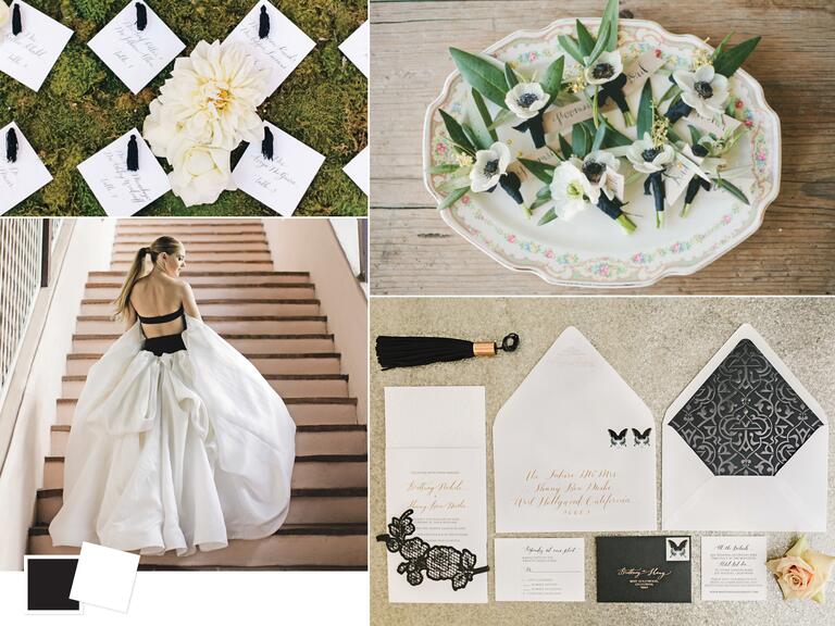
Friday, September 16, 2016

Classic Wedding Color Palettes We Love

Check out the hottest classic wedding color combos that we’re obsessed with right now.


  1. Black + White

    Inspiration for a black and white wedding color palette
    Photo by Clockwise from top left: Jana Williams Photography; onelove photography; Jana Williams Photography; Jana Williams Photography
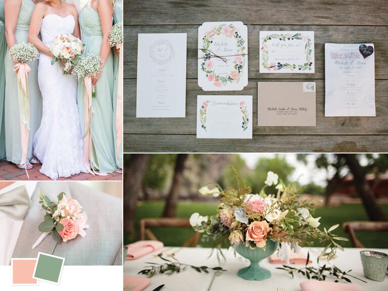
    Good for: formal winter weddings
    Tips for pulling it off: What's more classic than a timeless wedding color palette of black and white? It may seem intimidating to design, but you can make it your own with the use of different fabrics, textures and décor accents. If you really want to make a statement, wear a black and white gown. For something more subtle, keep an all-white look until the reception, then accessorize with a few pieces of black jewelry.
  2. Peach + Sage

    Wedding color inspiration for a peach and sage palette
    Photo by Clockwise from top left: Audrey Rose Photography; Robert & Kathleen Photographers; Jason+Gina Wedding Photographers; Audrey Rose Photography
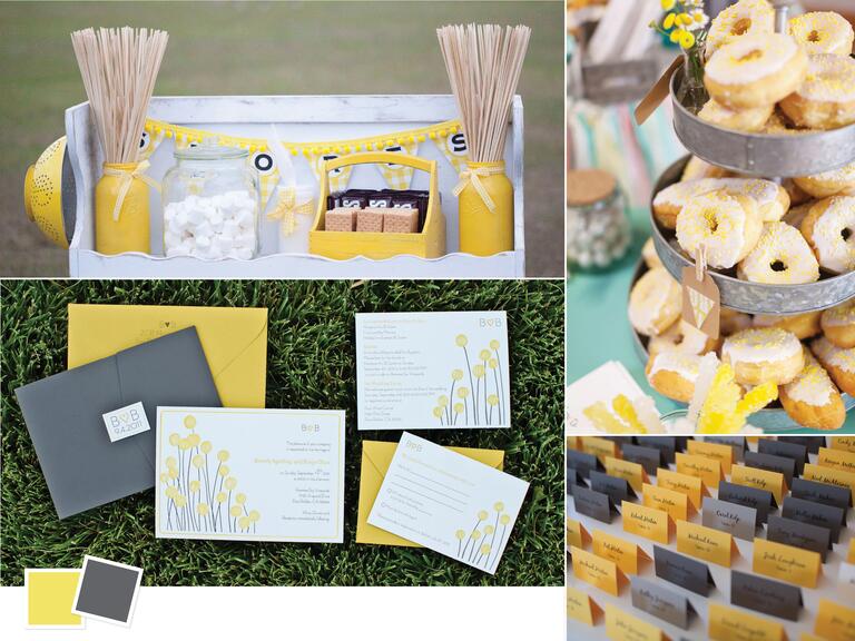
    Good for: whimsical spring weddings
    Tips for pulling it off: Looking for a pretty palette that radiates springtime enchantment? Peach and sage it is. These two colors live beautifully together, and they thrive when they're styled in an alfresco reception space. Continue to let spring blooms inspire the details all the way to your favor—a potted plant!

  3. Yellow + Gray

    Yellow and gray summer wedding color combo
    Photo by Clockwise from top left: Roohi Photography; L Photographie; Mandy Paige Photography; Mike Larson Photographer
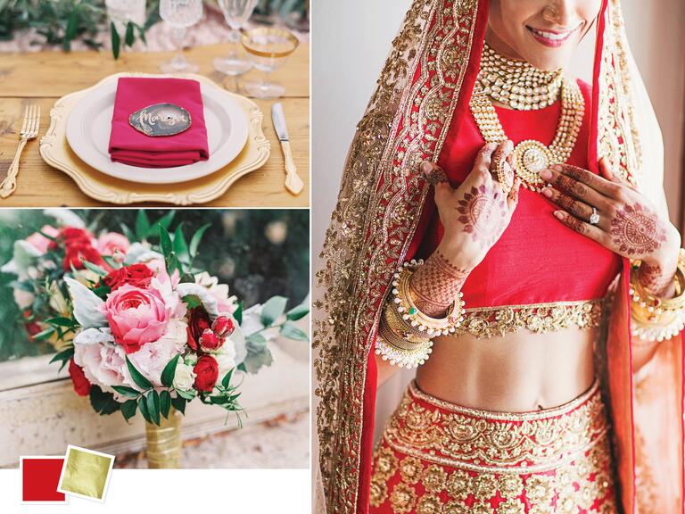
    Good for: casual outdoor weddings
    Tips for pulling it off: For a bright and inviting party vibe, opt for a cheerful palette of yellow anchored by a dark gray. Let yellow take the lead in all the accent details—think: envelope liners, bouquet wraps, cocktail napkins and even sprinkles! Then add in some gray (or sleek accents of silver) when you need to create depth. With a palette so cheerful, it should be matched with memorable entertainment, like an interactive dessert station or photo booth with quirky props.
  4. Red + Gold

    Red and gold wedding color inspiration
    Photo by Clockwise from top left: Mirelle Carmichael Photography; Our Labor Of Love; Mirelle Carmichael Photography
    Good for: formal summer or fall weddings
    Tips for pulling it off: We love the regal appeal that comes with gold in a color palette, especially when it's paired with red for a bold and modern look. Since red is such an eye-catching hue, you only need touches of it here and there for it to stand out. For example, decorate the tabletop with gold chargers, flatware and napkin rings, then accent with a single red napkin or place card. For your blooms, pair red stems with shades of pink to soften the floral arrangements and create a trendy monochromatic effect.
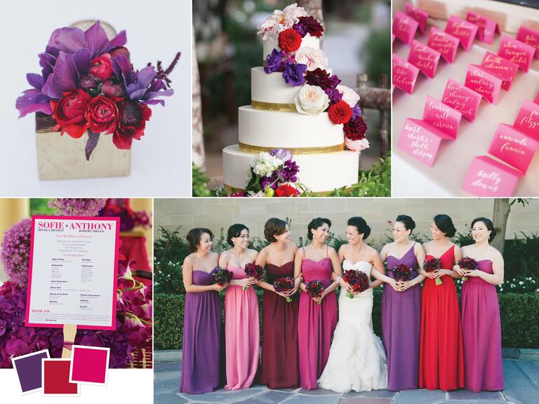
  5. Jewel Tones (Eggplant + Ruby + Fuchsia)

    Jewel toned wedding color palette
    Photo by Clockwise from top left: onelove photography; Allison Maginn; Jess Barfield Photography; onelove photography; Ron Soliman Photojournalism
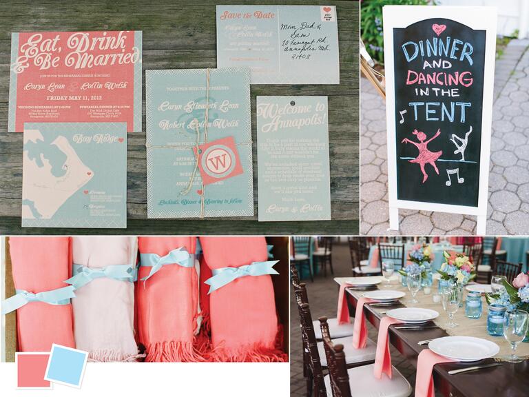
    Good for: formal fall weddings
    Tips for pulling it off: Can't decide on just two colors? No problem! Try a range of hues in the same color family. The key is picking colors that are close in saturation. You'll have nearly unlimited options when it comes to florals, and not to mention how thrilled your bridesmaids will be to pick out their own dress color. We love the sultry yet playful vibe created by a range of deep jewel tones.
  6. Coral + Light Blue

    Coral and light blue beach themed wedding inspiration
    Photo by Clockwise from top left: Gabe Aceves Photography; B Hull Photography; Laura Simson Photography; Sweet Tea Photography
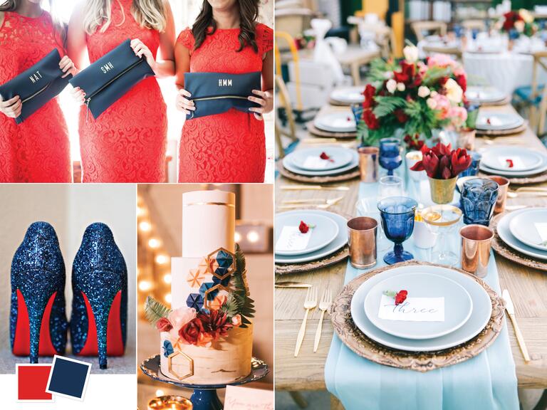
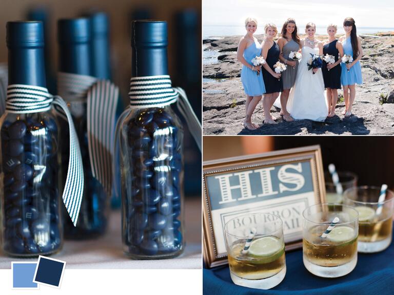
    Good for: outdoor summer weddings
    Tips for pulling it off: For a coastal affair, keep things tranquil. A light blue hue will complement any waterside event, and a preppy pop of coral (think: inside of a conch shell) will keep the vibes upbeat and fresh. Incorporate a water element onto your tabletops with floating candles to really round out the aesthetic.
  7. Scarlet + Navy

    Scarlet and navy summer wedding color combo
    Photo by Clockwise from top left: Jacqueline Patton Photography; Brandon Kidd Photography; Brandon Kidd Photography; Broxton Art Photography
    Good for: vibrant summer weddings
    Tips for pulling it off: Keep the look less "America the Beautiful" and more "your wedding is beautiful!" by adjusting the shade of your colors and playing with textured materials. Mismatched colored glassware, embossed charger plates and contemporary flatware make for one stylish reception.
  8. Lavender + Sage

    Organic sage and lavender wedding color palette
    Photo by Clockwise from top left: Artistrie Co.; Joshua Aull Photography; Birds of a Feather; Heather Payne Photography
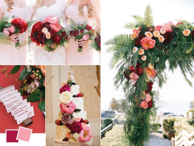
    Good for: formal spring weddings
    Tips for pulling it off: Soft and sweet, this organic palette is perfect for a sophisticated alfresco reception. Coordinate the wedding party with lavender dresses for the bridesmaids and matching pocket squares or bow ties for the guys. When it comes to the reception, wake up your guests' senses by garnishing each escort card or place setting with sprigs of lavender, or incorporate it into a signature cocktail. For the finishing touch, add layers of lace, tulle or other billowy fabrics to soften tablescapes and add wisps of color.
  9. Peony + Burgundy

    Summer peony and burgundy wedding color combo
    Photo by Clockwise from top left: Brandon Kidd Photography; Brandon Kidd Photography; Meg Ruth Photo; Eli Turner Studios
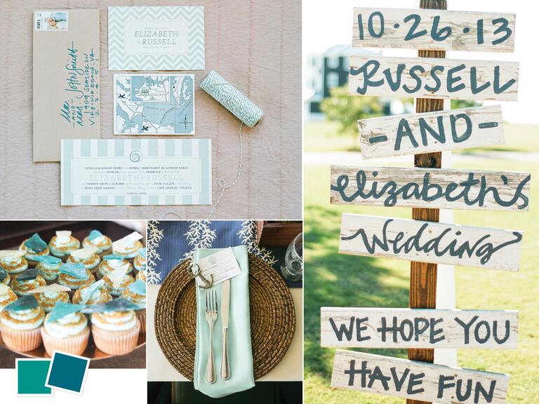
    Good for: casual late-summer weddings
    Tips for pulling it off: Are you totally inspired by peonies? We don't blame you. Lean on your favorite summer bloom to anchor your wedding color palette and décor. Paired with a dark red and contrasted with plenty of greenery, these flower focal points can go a long way. If you can't spring for a reception full of peonies, incorporate a peony motif into your stationery and signage to keep the theme consistent without splurging on a lot of stems.
  10. Jade + Cerulean

    Seaside destination wedding color palette
    Photo by Clockwise from top left: Jodi Miller Photography; Jodi Miller Photography; Jodi Miller Photography; One Eleven Images
    Good for: destination weddings
    Tips for pulling it off: Planning a nautical bash? Get inspired by a monochromatic palette of chic seaglass blues. Print and texture mixing is encouraged, along with a signature sip and dessert bar that perpetuates the color scheme.
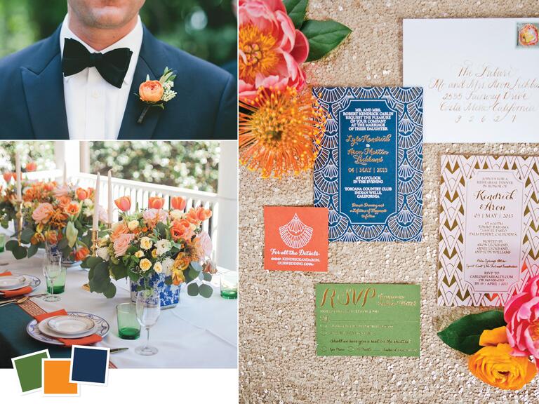
  11. Hunter Green + Orange + Navy

    Hunter green, orange and navy fall wedding color palette
    Photo by Clockwise from top left: onelove photography; onelove photography; Ashley Seawell Photography
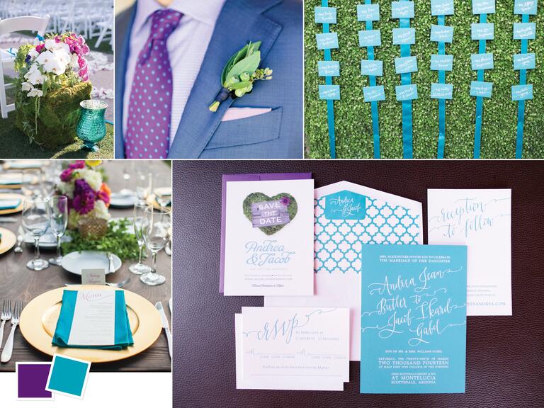
    Good for: eclectic fall weddings
    Tips for pulling it off: For something contemporary and totally trendy, go for a colorful palette of green, orange and navy. We love coordinated groomsmen, but for the fashion-forward groom, a dapper two-toned navy suit with black lapels is a sure way to stand out from the crowd. If formal is what you're after, elegant patterned china and colored stemware is a great way to steer the vibe away from boho and toward country club chic.
  12. Purple + Turquoise

    Vineyard wedding color inspiration with turquoise and purple
    Photo by Clockwise from top left: Melissa Jill Photography; Annie Mcelwain; Melissa Jill Photography; Melissa Jill Photography; Allison Maginn
    Good for: modern vineyard weddings
    Tips for pulling it off: Want a color pairing that's equal parts bold and beautiful? A vibrant turquoise and pure purple combo is perfect for the couple who wants to make a statement. Turquoise pairs beautifully with the natural greens in your florals, so amp up the greenery for more of a garden vibe. If glam is what you're going for, incorporate exotic flowers like orchids and add some metallic accents into the mix.
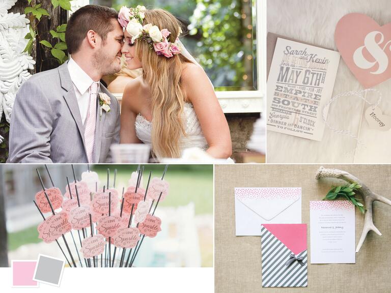
  13. Ballet Slipper Pink + Dove Gray

    Romantic light pink and gray wedding color palette
    Photo by Clockwise from top left: Photo Love; Our Labor Of Love; Shara Jo Photography; Studio Finch Photography
    Good for: romantic backyard weddings
    Tips for pulling it off: These two soft colors act as a neutral base for romantic details. We're talking scenic backdrops, overhead bistro lighting, fabric drapings and lengthy garlands of greenery—and don't forget the flower crowns! The perfect finishing touch? A dramatic exit with sparklers aplenty.
  14. Cornflower Blue + Navy

    Photo by Clockwise from left: Meg Ann Photography; Meg Ann Photography; Marni Rothschild Pictures
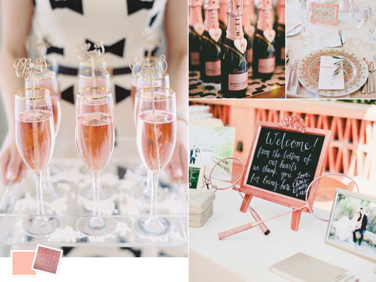
    Good for: coastal nautical weddings
    Tips for pulling it off: We love a good seafaring navy, and we love it even more when it's accented with a peppy cornflower blue. Hop on the mismatched dress trend and let your bridesmaids choose which shade looks best on them, while still achieving a coordinated look. Natural blue florals are limited (you could go with white flowers with a blue tint), so lean on white blooms to blend in with the rest of the décor, while placing blue details elsewhere, like tabletop, bar and favors.
  15. Rose + Rose Gold

    Bright summer wedding color palette with rose and rose gold
    Photo by Clockwise from left: Abby Jiu Photography; onelove photography; onelove photography; onelove photography
    Good for: preppy summer weddings
    Tips for pulling it off: Rose gold is having a moment—not only in the jewelry world, but in the décor world too. Metallic blush accents are popping up everywhere from dinner plate designs to welcome signs. Our favorite rose gold moment? The foil on mini champagne splits. It's perfectly coordinated with the color scheme and makes for the cutest favor.

0 comments:

Post a Comment