-
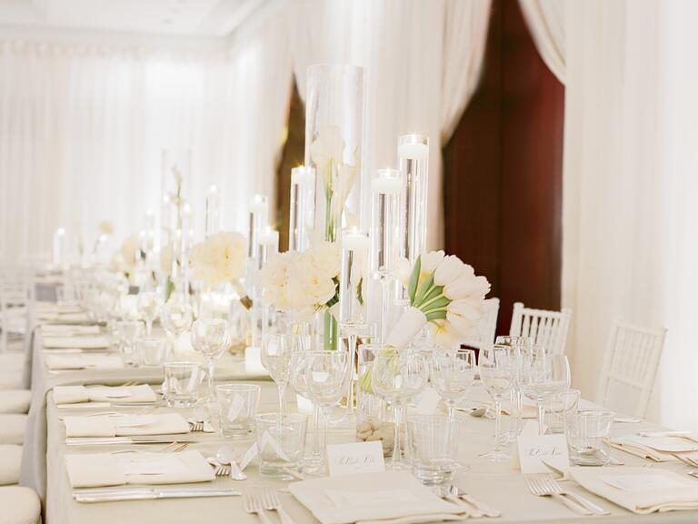
Mistake 1: Using Too Many Colors
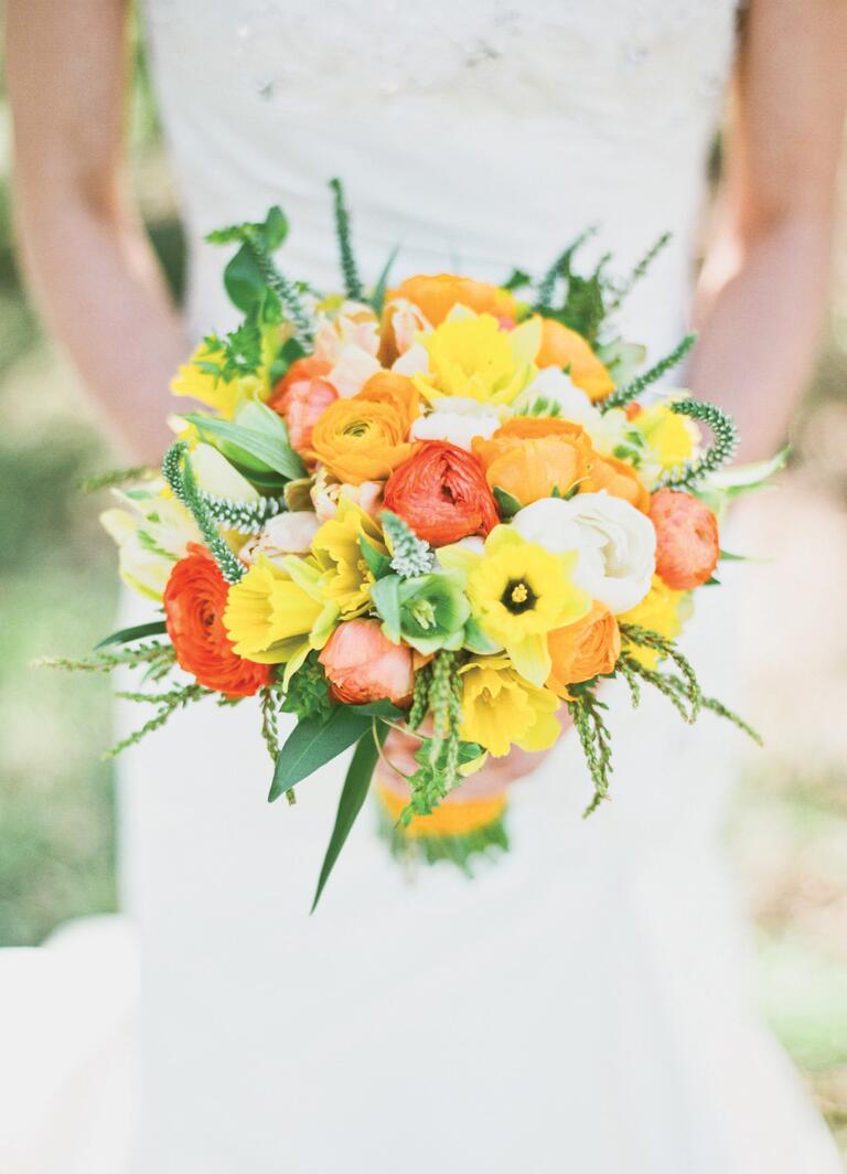
The Fix: Keep It SimplePhoto by Abby Jiu PhotographyWith a few exceptions (see our next fix!), you should pick two to four colors that go well altogether and stick to them. Using the same colors throughout your wedding décor will help create a cohesive flow, so that every detail looks like it belongs in your vision. Narrowing your palette to a few colors will also keep elements like your centerpieces from looking too messy. If you prefer an undone look, opt for a few slightly varied shades of the same color. This will add depth without looking too chaotic. Or, for an especially striking style, go monochromatic with a bold shade, like vivid purple or creamy white. The idea is to keep the look tailored for maximum impact.
-
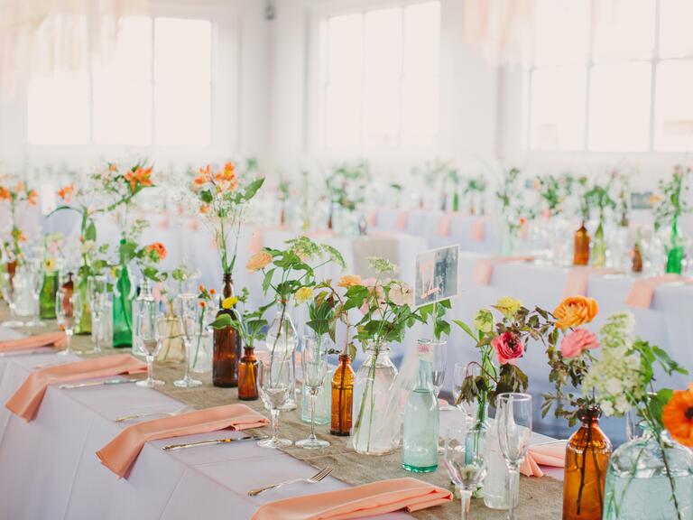
Mistake 2: Limiting Yourself to Only Two Distinct Colors
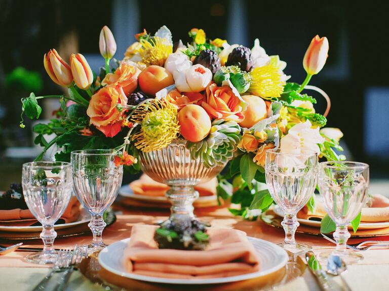
The Fix: Break Rule #1 (Wisely)Photo by Philip FicksWe're so over the strict "color combo" rule. Many gorgeous weddings have a variety of colors -- sometimes up to five -- that work together. The way to pull it off is to use more than one neutral, like cream and brown, in your color palette, or go for multiple shades of the same color to create a tonal color scheme. We love the idea of a summery color palette inspired by the many shades of hydrangeas, including sapphire and sky blue paired with white and gray, finished off with a few pops of sunny yellow to make it feel light and bright. A color palette with more than three or four colors can also help you create a specific scene -- like an English garden with green, yellow, pink, red and cream, or fall in New England with orange, red, yellow, brown and gold.
-
Mistake 3: Choosing Trendy Colors
The Fix: Skip FadsPhoto by Lauren Fair PhotographyIt's easy to get carried away with ideas you see in other weddings or in magazines and inspiration boards, but just because you love a fresh and unexpected idea on paper doesn't mean it's the right choice for your wedding. Your palette should be one that you won't mind living with for a long time, since you'll be framing photos and filling albums with those colors. If you're drawn to a color that's hot right now, consider using the trendy hue sparingly instead of making it the main event. Think about the colors and patterns you surround yourself with daily. Ask yourself: What colors make you happy? What color is your favorite room or sweater? The simplest meaningful objects, like a scarf or even a pillow, inspired some of the prettiest weddings we've seen.
-
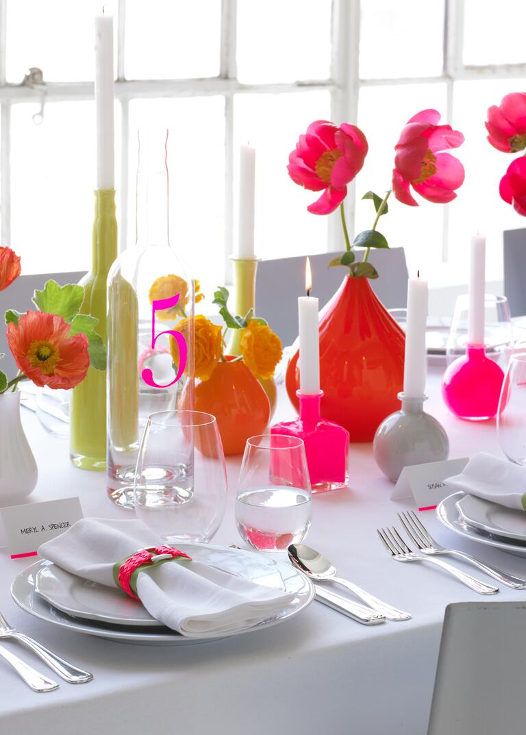
Mistake 4: Using the Wrong Color Ratio
The Fix: Balance BrightsPhoto by Christina Carroll PhotographyOne of the biggest pitfalls in color selection is not considering the eye's need for rest and calm. Just because you have two dominant colors in your palette doesn't mean you should use them equally. Before you go any further in your planning, decide which hue will take center stage -- this choice will affect your decisions from linens to lighting. If you love bright orange, pick a more muted shade for your secondary color, like pale blue or navy instead of bright aqua. You want your colors to be complementary to your décor, but not distracting. The resulting contrast will let your favorite color shine. Thoughtfully balancing your colors is the key to making even the most crazy combinations look chic and sophisticated. Another option: Pick a few shades that are in between colors, like coral instead of bright orange and plum instead of amethyst.
-
Mistake 5: Choosing Predictable Colors
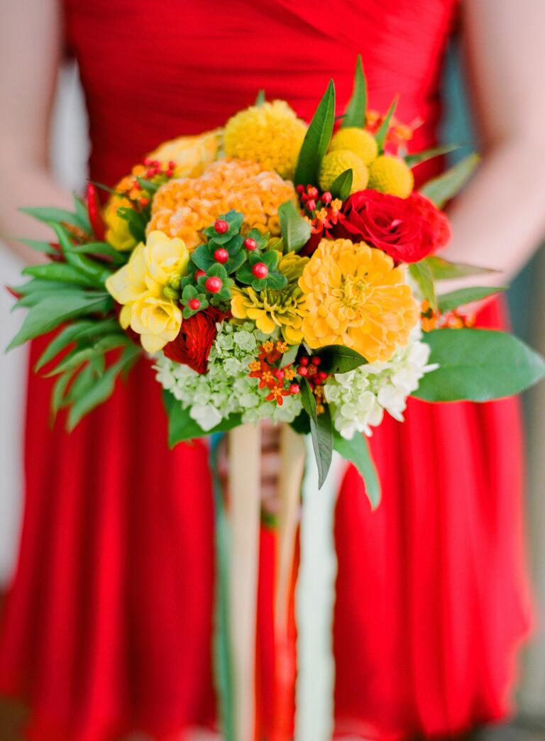
The Fix: Take (a Little) RiskPhoto by Jen Fariello PhotographyCertain color combos come with obvious connotations. (What comes to mind with the combination of red, white and blue, or red and green?) Keep your colors from reminding guests of their favorite holiday by subtly tweaking your hues. The trick is switching up at least one shade to downplay the resemblance. Instead of your standard red, white and blue, try bandana-red, faded denim and eggshell to banish any thoughts of Fourth of July. The same goes for forest green and pale pink if you're worried about your wedding looking Christmas-y. Or try adding another color to downplay the combo. Yellow dresses with red bouquets might conjure images of a popular fast-food restaurant, but breaking up the colors with white details, like lace or pearls, is a simple way to add elegance.
-
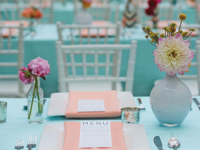
Mistake 6: Ignoring Texture
The Fix: Broaden Your Definition of MatchingPhoto by Beaux Arts PhotographieTwo colors that go together may not look right when put side by side if they're different textures. A burlap table runner with red satin linens doesn't work as well as wooden planters on maroon cotton tablecloths, even though the colors are the same. Because your linens will cover so much of your wedding reception, they’ll play a huge role in your color and texture decisions. Mixing textures in the same hue can also add more drama and depth to your wedding than simply combining multiple colors. Patterns like stripes or florals can help break up bold colors, so a hue like bright yellow or black doesn’t overwhelm your tables.
-
Mistake 7: Ignoring Your Venue Colors
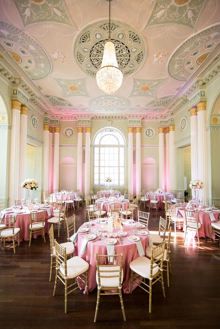
The Fix: Pick A Priority (Colors or Venue)Photo by Anna and Spencer PhotographyAs you're venue hunting, have a color scheme in mind while you look at details like the wall coverings, art and carpeting, or keep your color options open until you find a venue you love. Think about what hues you may want to use, and whether you’d want to prioritize finding the perfect venue or having your perfect palette. In a country club with navy and maroon carpets, a color scheme of lime green and hot pink will clash, and there's really no way around it. (Try to pull it off anyway and you'll end up spending twice what you would normally in decor to cover it up.) That's not to say you have to choose a venue where your colors perfectly match the floors, but you should use the venue's decor as a guide when picking out tones and hues. Do you love pink but have dark colors to work around? Try a soft blush instead of fuchsia.
-
Mistake 8: Not Coordinating Your Paper Elements
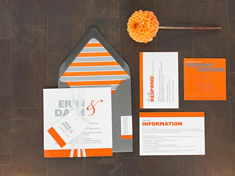
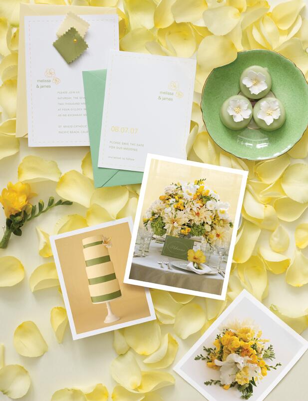
The Fix: Include Your Colors in Your Invitation SuitePhoto by Tess Pace PhotographyYour invitations set the stage for the event, so let them introduce your wedding colors and evoke the right tone from the start. Coordinating the invitation colors with those of the wedding can be as easy as choosing a colored font, ribbon or monogram, or as elaborate as layering colored paper. Most importantly: Don’t sacrifice readability for style. That means the type should contrast with the paper, so balance brighter shades with neutrals and avoid light-colored fonts. Bold ink hues like navy and fuchsia work well, and ask your designer about typeface techniques like letterpress or foiling to make your font stand out. Also consider that invites are a dress code cue for your guests. You wouldn't send out formal ivory cards with black calligraphy unless you're expecting guests to dress black tie for your wedding.
-
Mistake 9: Trying to Color-Match the Flowers
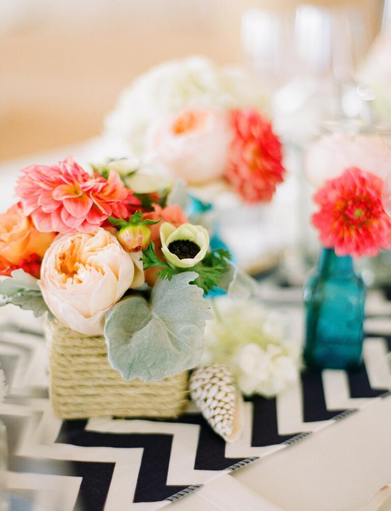
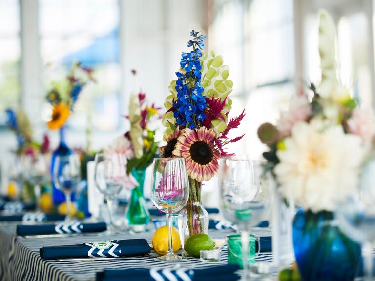
The Fix: Don't Force ItPhoto by Justin & MaryInstead of insisting your floral bouquets and centerpieces match, ask your florist to choose complementary neutral flowers that will soften (not compete with) the color scheme. Then let your nonfloral elements, like the centerpiece vases and bouquet ribbon wraps, show off your color. If you love blue, keep in mind very few flowers are blue naturally, and the ones that do, including hydrangeas, are extremely seasonal.
-
Mistake 10: Relying on Your Bridesmaids to Pull Off the Themed Color
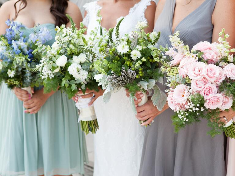
The Fix: Choose Complementary Neutrals and Use Colorful AccessoriesPhoto by Melissa Robotti PhotographyWhen it comes to your bridal party, choose the most flattering color in your palette and use it (look to neutral colors if you're at all unsure). Shades like burnt orange and olive green might look great on details like your table linen overlays, dinner plates and glassware, but aren't exactly wearable, especially if you're going monochromatic for your bridesmaid dresses. The days of the exactly matched bridesmaids are over. Instead, it’s much more chic if your bridesmaid dresses complement your palette, and if you really want your bridesmaids to wear a bolder color, then choose accessories in that hue. Have your bridesmaids rock that color with a belt, pretty necklace or shoes. Stick to universally flattering colors like eggplant, navy, blush, ivory or black. Follow this rule and not only will your bridesmaids look great, so will your wedding photos!
-
Mistake 11: Choosing Colors That Don't Fit the Mood
The Fix: Lighten or Ramp Up Your Color PalettePhoto by Aaron Young PhotographyThough yellow may be your favorite color, it might not be the ideal shade for an evening wedding on New Year's Eve. Likewise, shimmering metallic silver might not set the right tone for an afternoon garden reception in a small New England town. If you're set on a color you don't think will work with the atmosphere you're trying to create, think about your accent colors. Adding lots of navy can make yellow seem more refined and formal, while pairing it with white or another pastel takes it in more of a whimsical direction. Your color scheme will set the tone for the mood of your wedding, so figure out which emotions you want your celebration to evoke before you pick your palette—whether you're going for a more relaxed daytime affair or a regal and elegant ballroom wedding.
-
Mistake 12: Limiting Yourself to Seasonal Color Rules
The Fix: Think SeasonlessPhoto by Tinywater PhotographyIt's time to forget about outdated seasonal color rules, like pastels are only for spring and the idea that you can't have an orange and yellow hued wedding unless it's fall. You should pick a color palette that you love and then tailor it to the particular season with accent colors, texture and décor as well as changing up the shade. The way to pull off a pastel winter wedding is to swap out rosy pink for a more muted blush and use dusty sage instead of seafoam or mint green. Pairing your color palette with seasonal flowers and seasonally inspired décor elements, like evergreens and faux-fur chair backs (if you're having a winter wedding), will actually make your wedding style complement the season without seeming overly themed.
-
Mistake 13: Not Giving Visual Examples to Your Wedding Pros
The Fix: Get Specific With Your ColorPhoto by Antonis AchilleosNarrow your colors down to exact shades, so instead of green and white, you’ll know if it’s lime green, Kelly green, sage green or forest green, and ecru, ivory or cream. Add any swatches or chips to a style or inspiration board to make it easier to communicate with all of your wedding pros about your vision, and help you stay focused when you’re shopping for décor. Get ideas from paint company websites like Behr.com, Sherwin-Williams.com, Glidden.com and BenjaminMoore.com. Interactive color wheels and looking at color palettes from weddings you like are other good places to start. If you have access to a Pantone color book, use it to select your shade the same way graphic designers do. Many invitation designers mix ink to match the colors in this book, and a lot of cake bakers use Pantone numbers as a reference when creating dye for frosting.
skip to main |
skip to sidebar

Smile Often~Laugh Alot~Dream BIG
Blog Archive
- December (7)
- November (21)
- October (23)
- September (25)
- August (23)
- July (22)
- June (23)
- May (23)
- April (20)
- March (23)
- February (23)
- January (23)
- December (23)
- November (23)
- October (25)
- September (24)
- August (22)
- July (26)
- June (25)
- May (21)
- April (23)
- March (27)
- February (24)
- January (26)
- December (27)
- November (24)
- October (30)
- September (27)
- August (27)
- July (25)
- June (24)
- May (26)
- April (30)
- March (28)
- February (28)
- January (33)
- December (26)
- November (31)
- October (35)
- September (38)
- August (48)
- July (50)
- June (45)
- May (52)
- April (49)
- March (42)
- February (26)
- January (50)
- December (43)
- November (62)
- October (62)
- September (68)
- August (72)
- July (67)
- June (61)
- May (71)
- April (74)
- March (88)
- February (50)
- January (57)
- December (60)
- November (68)
- October (53)
- September (67)
- August (62)
- July (44)
- June (33)
- April (1)
- March (1)
Labels
- Advice (325)
- Anniversary (34)
- Awareness (2)
- Babies (3)
- Bachelor (2)
- Bachelorette (13)
- Beauty (10)
- Birthday (47)
- Blessings (15)
- Blog (20)
- Bridal Party (1)
- Bridal Shower (23)
- Bride (181)
- Bridemaids (35)
- Bridesmaids (41)
- Bridezilla (4)
- Budget (35)
- Butterflies (1)
- Cake (12)
- Celebration (188)
- Celebrity (30)
- Ceremony (5)
- Charity (10)
- Coffee Talk (12)
- Colors (2)
- Congratulations (18)
- Contest (3)
- Countdown (121)
- Couples (7)
- Cute (6)
- Dance (4)
- Date Night (17)
- David Tutera (11)
- Decor (69)
- Diet (2)
- Dinner (11)
- Dress (51)
- Engagement (89)
- Etiquette (6)
- Etiquette; (9)
- Event (29)
- Faith (1)
- Family (168)
- Fashion (70)
- Favors (25)
- Fiancee (1)
- Fitness (8)
- Flowers (11)
- Food (88)
- Foodie (6)
- Friday Letters (66)
- Friends (91)
- Fun (70)
- Funny (99)
- Games (7)
- Gifts (46)
- Groom (71)
- Groomsmen (18)
- Guest (83)
- Hair (4)
- Happiness (17)
- Healthy (16)
- Holidays (24)
- Home (20)
- Honeymoon (28)
- Hotel (6)
- Husband (177)
- Ideas (296)
- In-Laws (2)
- Instagram (23)
- Invitations (34)
- Its OK (10)
- Kids (42)
- Life (382)
- List (317)
- Love (604)
- Makeup (2)
- Marriage (344)
- Me Myself and I (1)
- Media (38)
- Memories (1)
- Money (12)
- Movies (5)
- Moving (15)
- Music (163)
- Name (2)
- Newlywed (34)
- News (210)
- Officiate (2)
- Parents (18)
- Party (35)
- Photo (40)
- Photography (72)
- Photos (245)
- Pinterest (21)
- Planner (15)
- Planning (286)
- Polls (3)
- Prayers (2)
- Press (14)
- Projects. DIY (19)
- Proposals (30)
- Quotes (1)
- Recap (10)
- Reception (66)
- Registry (17)
- Rehearsal (3)
- Relationships (26)
- Relax (10)
- Remembrance (34)
- Rings (27)
- Robbins Brothers (16)
- Romance (104)
- RSVP (4)
- Save The Dates (3)
- Shopping (17)
- Shows (4)
- Sick (1)
- Social Media (6)
- Spotlight (22)
- Stories (2)
- Style (144)
- Sweet Treats (8)
- Team Jascott (75)
- Thank You (7)
- Tips (437)
- Toast (4)
- Tradition (54)
- Travel (8)
- Trends (33)
- Valentine (1)
- Vendors (23)
- Venues (2)
- Videos (141)
- Vows (10)
- Wedded Bliss Wednesday (8)
- Wedding (726)
- Weddings (385)
- Weekend (132)
- Wife (161)
- Work (4)
Powered by Blogger.


0 comments:
Post a Comment